← All work
Product Design · Bank Islam · Pay Bills

Making bill payments in Bank Islam’s internet and mobile banking quick, repeatable and trusted

Bank Islam finances students’ studies and wants to keep them as customers for life. Yet the current app offers few ways to pay a bill, and it feels dated. I designed Pay Bills for its desktop and mobile apps: JomPAY, saved favourites, new bills, card and financing payments. I prototyped every flow and tested the shared patterns with 9 users.

Role
UX/UI team member
Scope
Pay Bills · Sprint 3
Platforms
Desktop and mobile
Domain
Digital banking
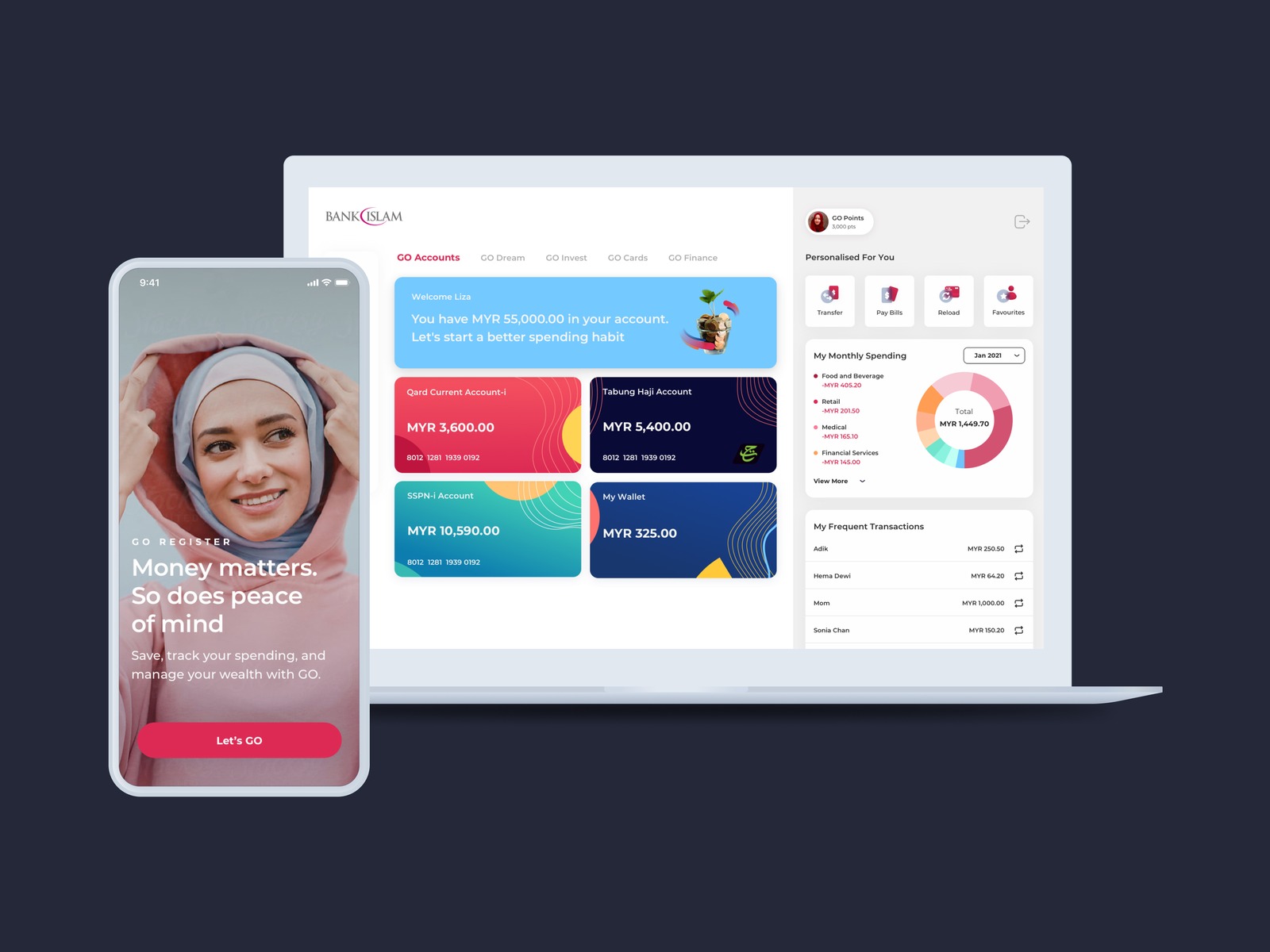
Bank Islam desktop and mobile banking designs
Context

Context

1

The project

Bank Islam was redesigning its two digital channels, internet banking on desktop and the GO mobile app.

This case study covers one piece of that work: how customers pay bills.

2

Who it is for

Young users, Muslim and non‑Muslim, with a focus on students and fresh graduates.

Bank Islam gives them financing to study and wants them to stay as loyal customers after they graduate.

3

In scope

Pay Bills and the spending report

FavouritesNew BillJomPAYPay CardPay FinancingSpending report

Out of scope: transfers, registration, and GO Dreams and Invest, covered in other sprints.

01 · The problem

The current app

What stood out: the options

A short list of entry options

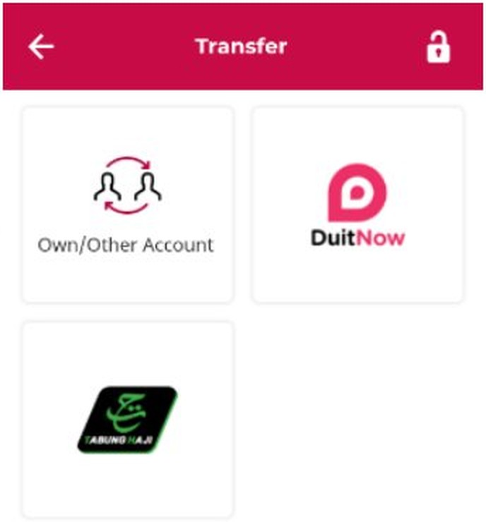
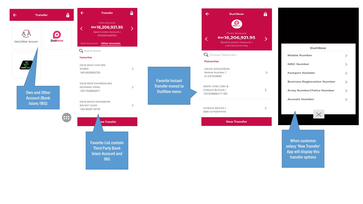
Tiles such as Own/Other Account and DuitNow.

Everything else sat behind DuitNow

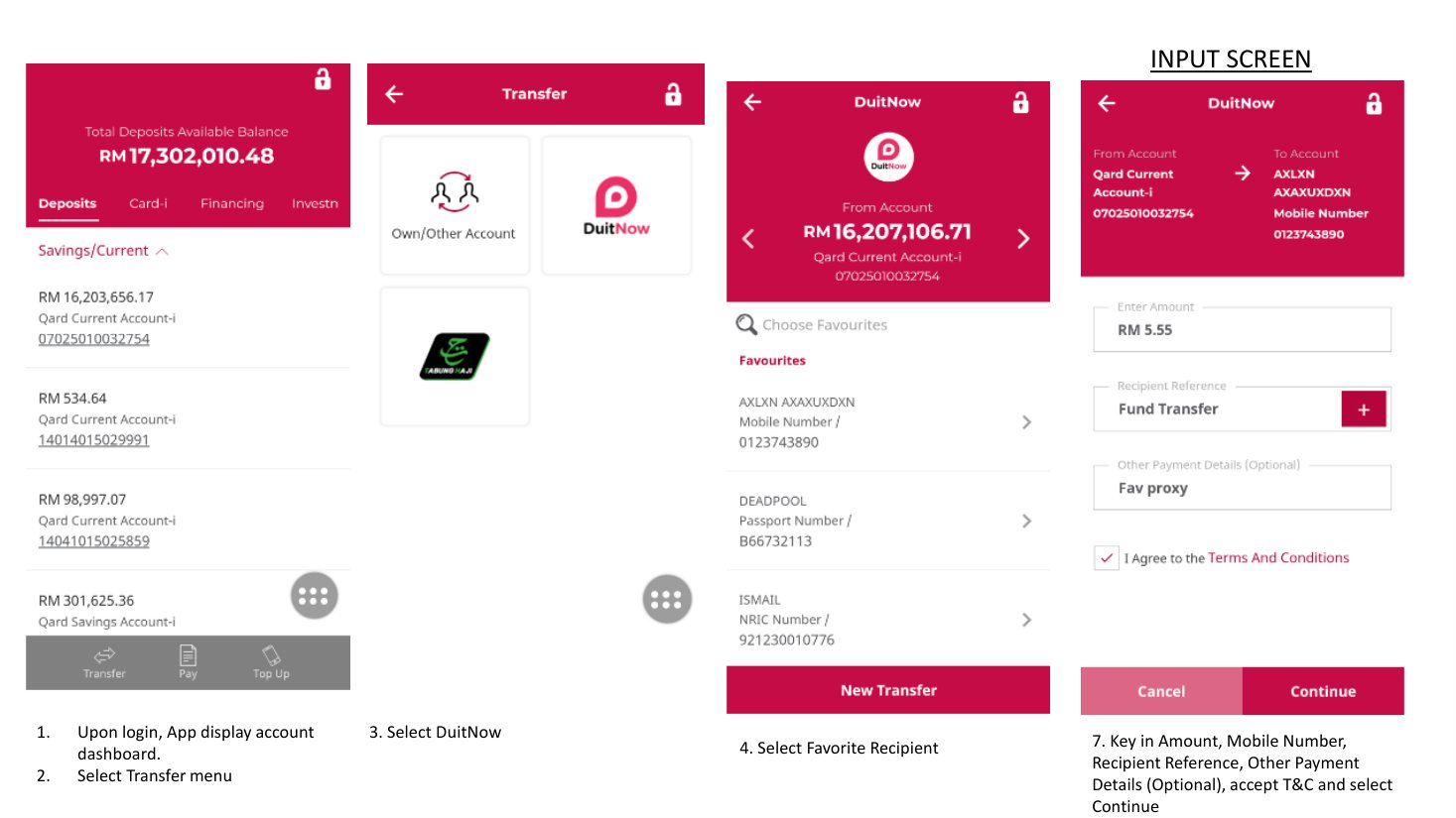
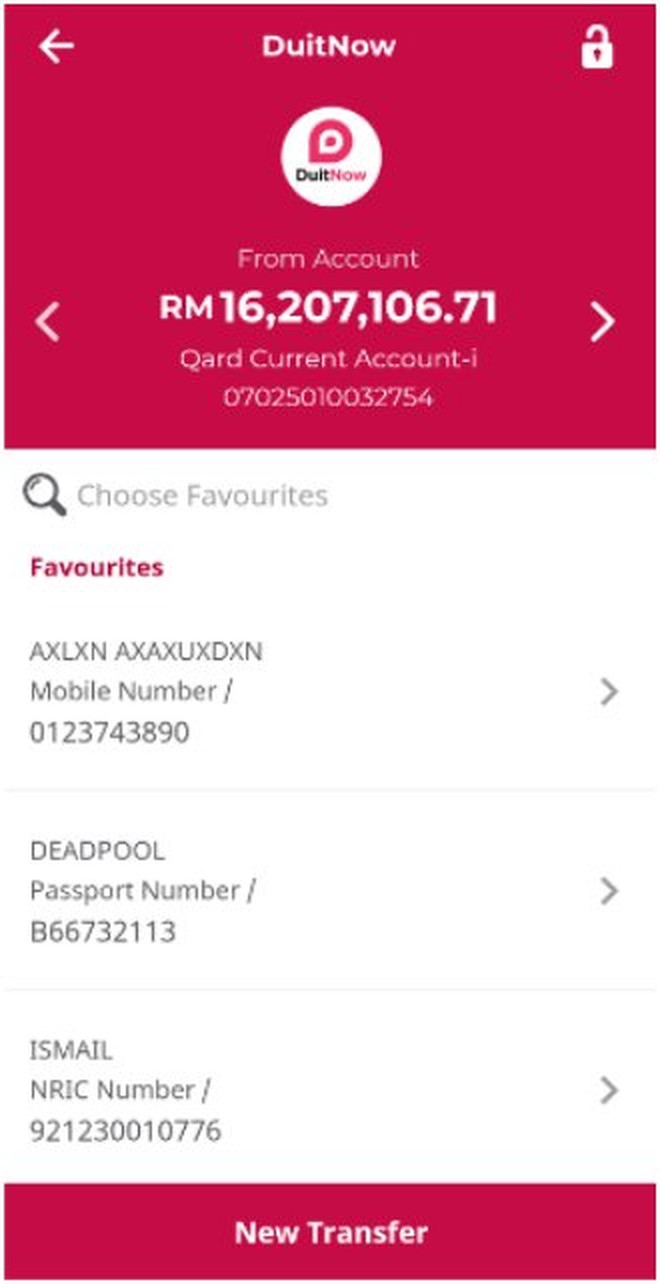
Favourites in a long list under a search box. New Transfer opens a list of ID types, from mobile number to passport to account number.

Organised by how money moves

Not by what the customer wants to pay.

These are my observations from the screens, not findings reported by users.

Old GO app: transfer menu, favourites list and New Transfer options
Transfer entry: Own/Other Account and DuitNow, with their favourites
Old GO app: steps from dashboard to the input screen with amount, reference and terms
The DuitNow path, from dashboard to input screen
01 · The problem

Problem statement

Students and fresh graduates need to pay bills easily, but the current app gives them few options, organised by how money moves rather than by what they pay, makes them re-enter payee details every time, and feels dated.

02 · How did we discover the problem

Design process

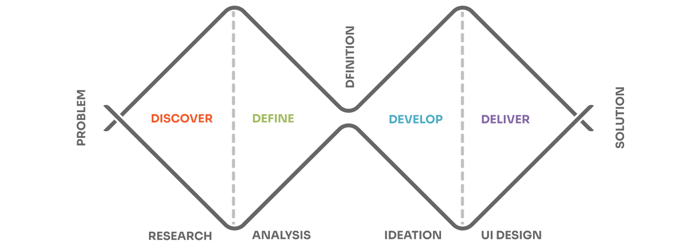
We followed the Double Diamond model: Discovery, Definition, Development and Delivery.

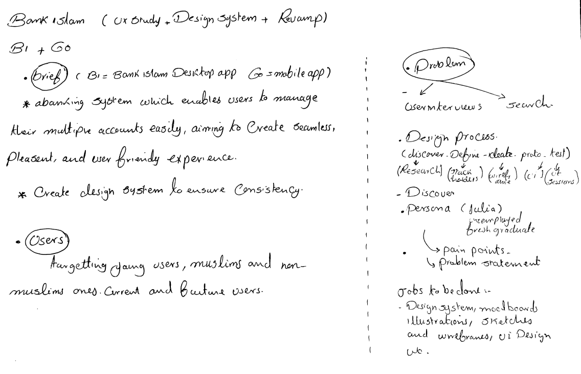
The handwritten kick-off notes capture the starting point: the brief, who the users are, and the plan.

Double Diamond design process
Handwritten kick-off notes covering the brief, users and design process
02 · How did we discover the problem

Interviews

We started with video-call interviews to learn users’ pain points, then ran exploratory interviews on feature enhancements, new services and UI changes.

7

Current users

Interviewed over video calls.

2

Groups

Students and graduates.

1 hour

Each interview

Pain points, feature enhancements, new services and UI changes.

02 · How did we discover the problem

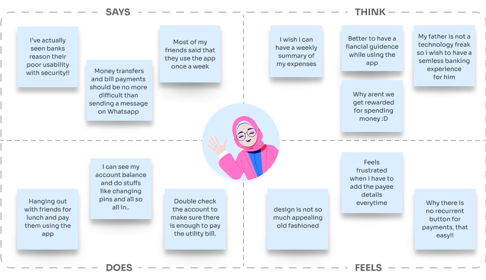
What 7 users told us

One empathy map, built from all 7 interviews.

Empathy map: what users say, think, do and feel
02 · How did we discover the problem

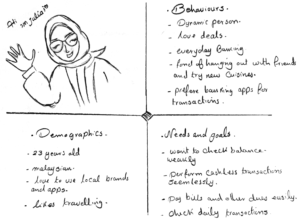
Meet Julia

23 years oldMalaysianFresh graduate

She prefers banking apps for her transactions, and loves deals, travel and local brands.

What she needs

Pay bills and other dues easily

Make cashless transactions seamlessly

Check her balance weekly and her daily transactions

Persona sketch of Julia: behaviours, demographics, needs and goals
02 · How did we discover the problem

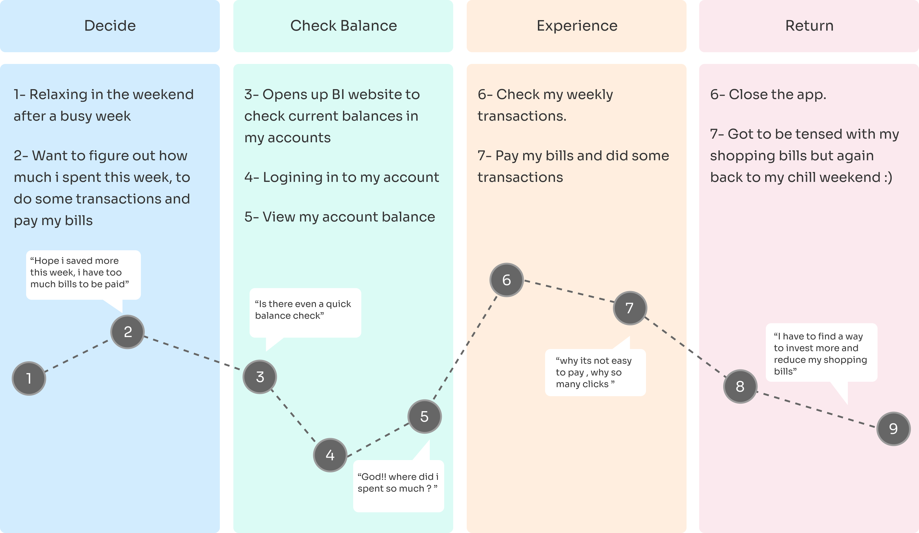
User journey

Julia’s journey, mapped step by step, showed where banking gets in her way. The low point is step 7, when she pays her bills: “why it’s not easy to pay, why so many clicks”.

User journey
02 · How did we discover the problem

Key insights

People pay for different reasons

“Hanging out with friends for lunch and pay them using the app”

Repeat payments take repeat effort

“Feels frustrated when I have to add the payee details every time”

Paying should feel as easy as messaging

“Money transfers and bill payments should be no more difficult than sending a message on Whatsapp”

People want to know where their money goes

“I wish I can have a weekly summary of my expenses”

Spending should give something back

“Why aren’t we get rewarded for spending money :D”

The design feels old-fashioned

“Design is not so much appealing, old fashioned”

Quotes are from the empathy map built from all 7 interviews.

03 · Define

How might we

How might we help students and fresh graduates pay the different people and bills in their lives as easily as sending a message, without re-entering the same details every time, and stay on top of their spending?

04 · Solutions explored

Options explored

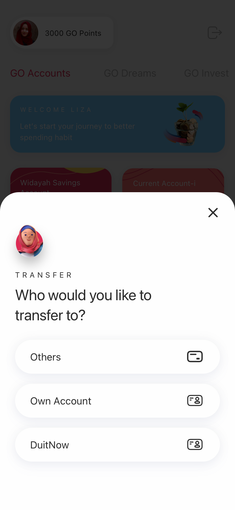
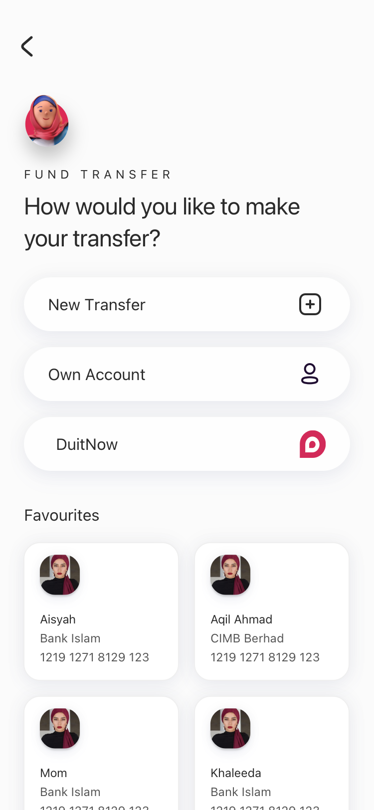
Pay Bills inherited one question from the Fund Transfer work: where should saved payees live? These are the patterns explored there, next to the one Pay Bills uses.

Option A: transfer options in a bottom sheet over the dashboard
A · Options in a bottom sheet
Option B: options with a favourites grid on the same screen
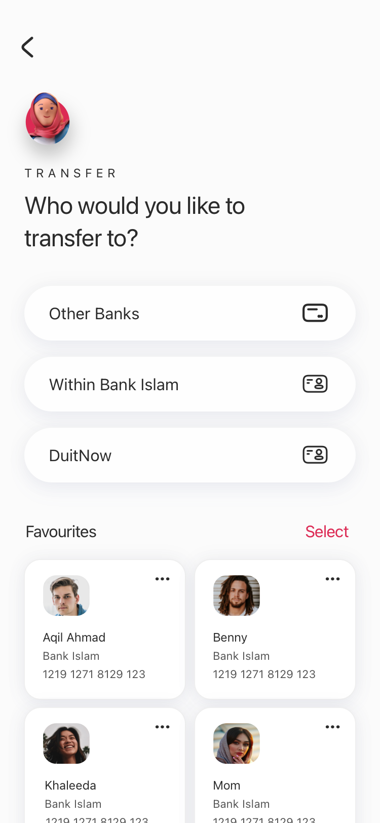
B · Favourites inline on the entry screen
Option B2: inline favourites with Select and more actions
B2 · Inline, with Select and manage
Chosen: a dedicated Favourites step in Pay Bills
C · A dedicated Favourites step (chosen)
04 · Solutions explored

Trade-offs

CriterionA · Bottom sheetB · Favourites inlineC · Dedicated step (chosen)
Repeat paymentsFavourites are not on this screen, so they cost an extra step.Fastest: favourites are visible on arrival.One extra tap, then a full list.
Entry screen clarityClean: a few options only.Crowded: options and a favourites grid compete.Clean: five routes, nothing else.
As favourites growNot applicable.The grid pushes content down the screen.The list can scroll, search and be managed.
First-time payersClear.Favourites can distract from New Bill.Clear: New Bill and JomPAY are first-level routes.
Desktop and mobileA bottom sheet does not map to desktop.A grid is cramped in a side panel.The same steps work in the desktop side panel.

A qualitative assessment from reviewing the screens. It was not measured in testing.

05 · Final solution

Before and after

Entry point

Old transfer entry with icon tiles
Before
New Pay Bills entry with five routes
After

Icon tiles that start with how money moves.

One screen with five labelled routes.

Saved payees

Old favourites list under a search box
Before
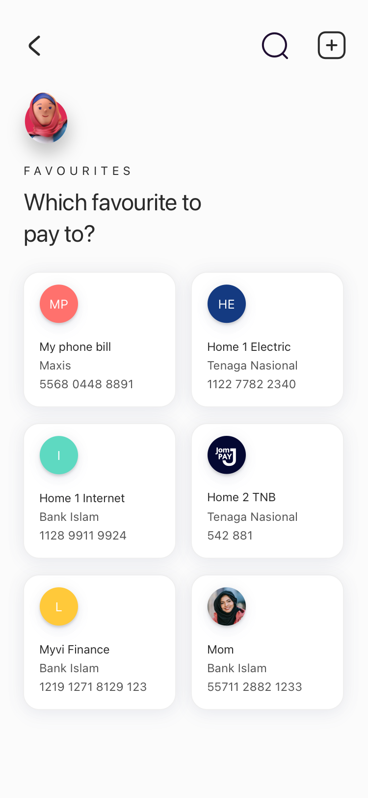
New Favourites grid with logos
After

A favourites list under a search box.

A dedicated Favourites step with names and logos.

Confirming

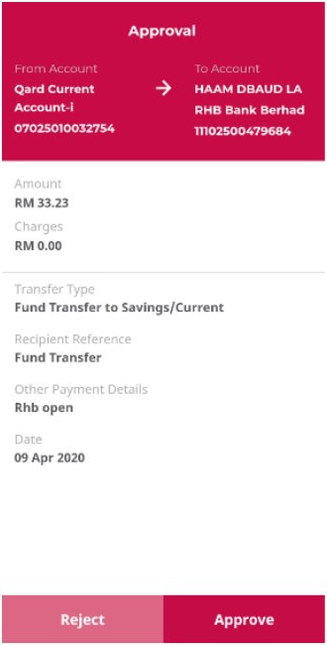
Old approval screen
Before
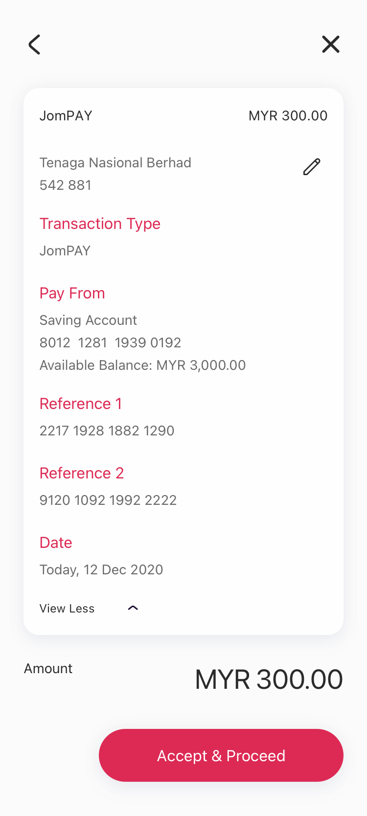
New single review card
After

A verify screen, then a separate Approve step.

One review card, then an i-Access code.

05 · Final solution

On mobile

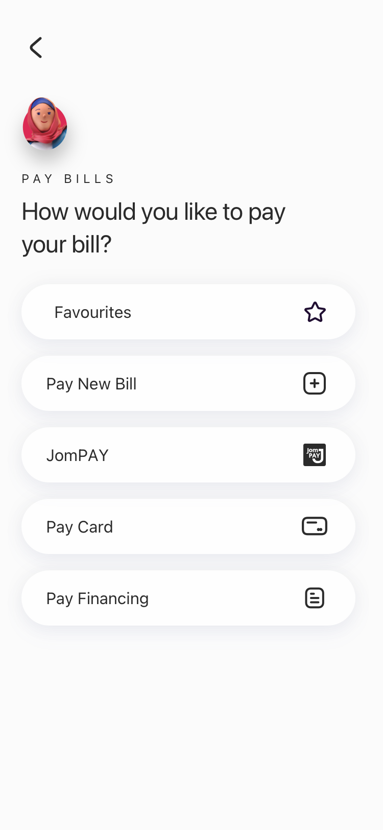
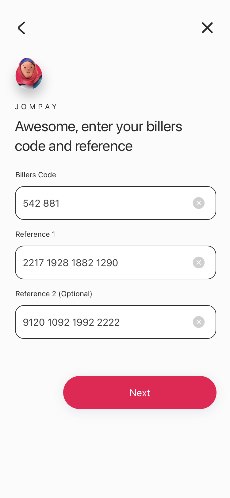
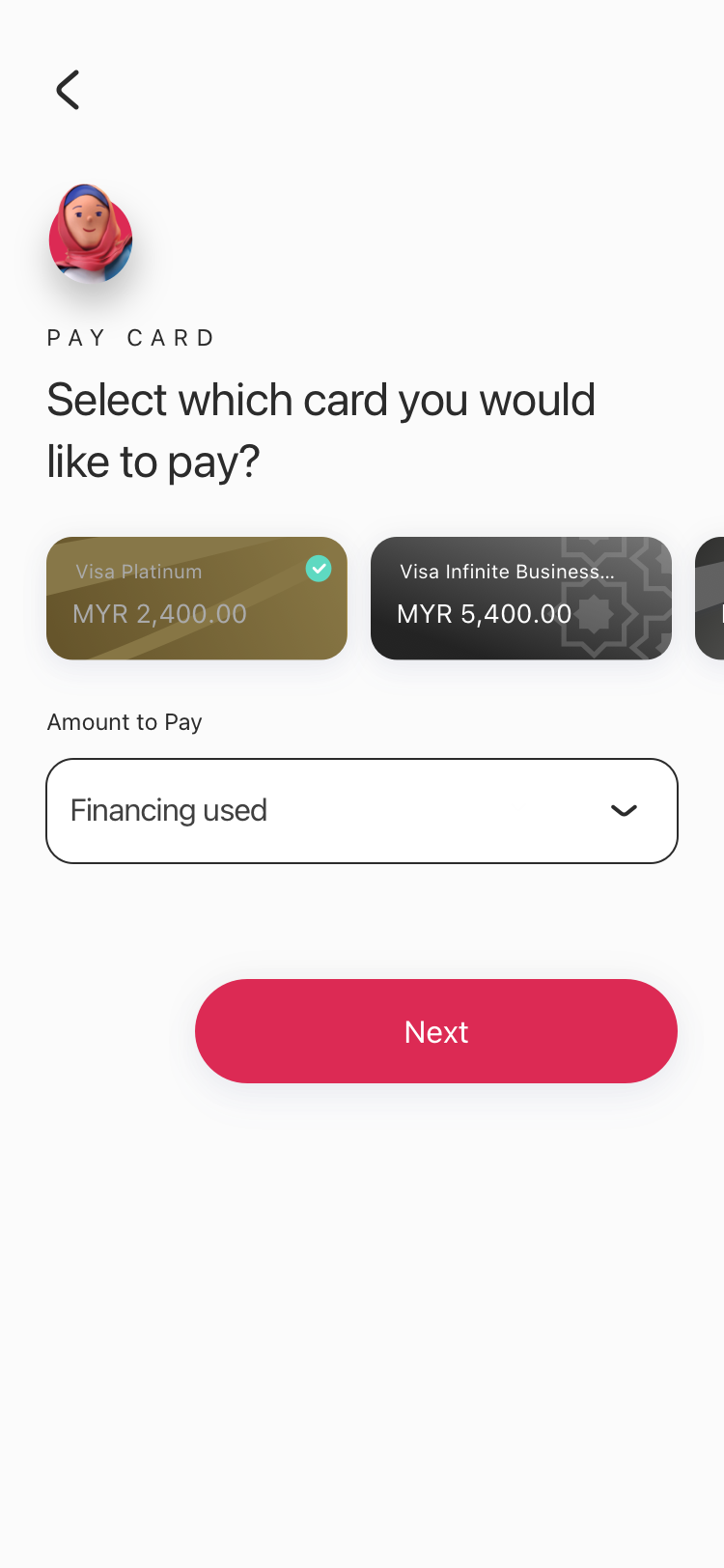
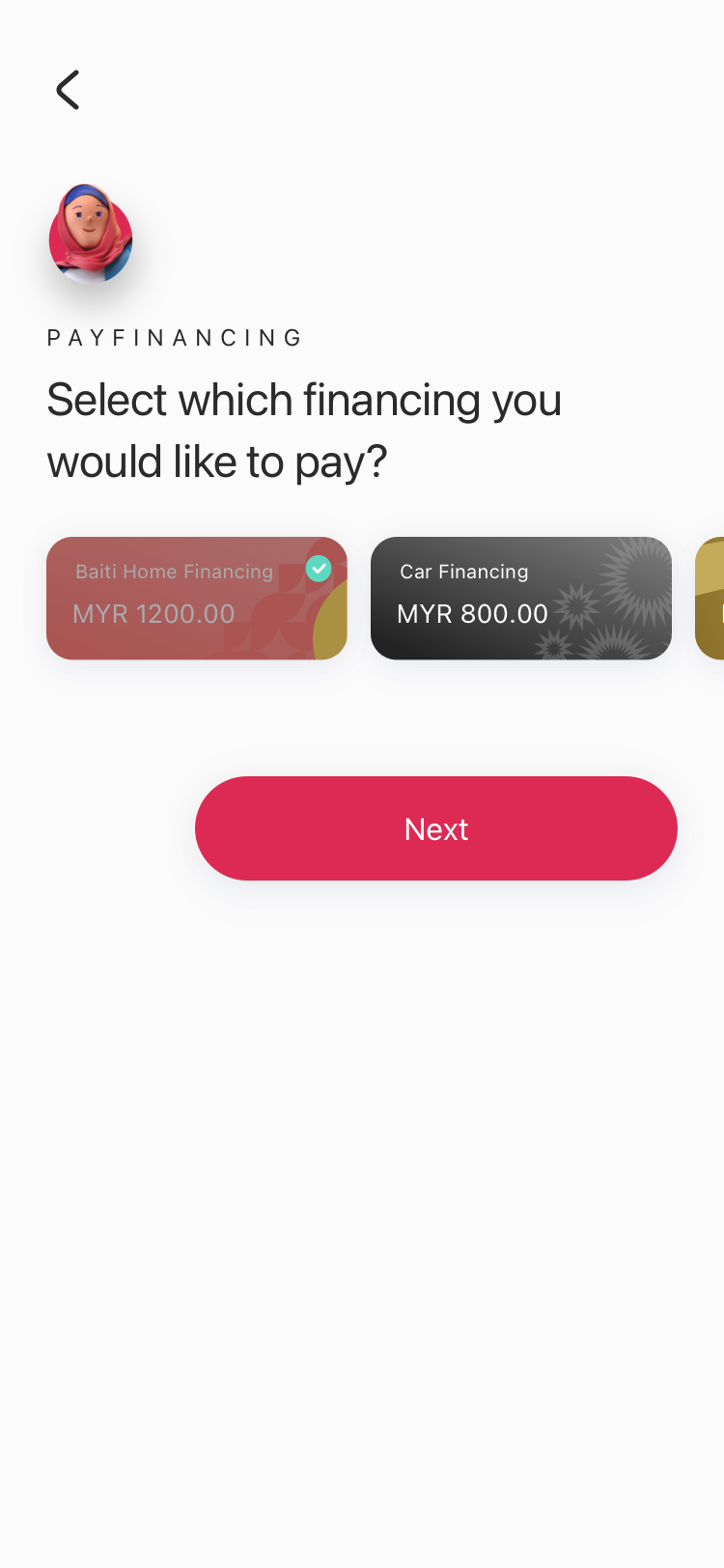
One Pay Bills screen leads to every way of paying: Favourites, New Bill, JomPAY, Pay Card and Pay Financing. Each route is short, and ends with a review and a success screen.

Mobile: Pay Bills entry with five routes
Pay Bills entry
Favourites: list of saved billers
Favourites
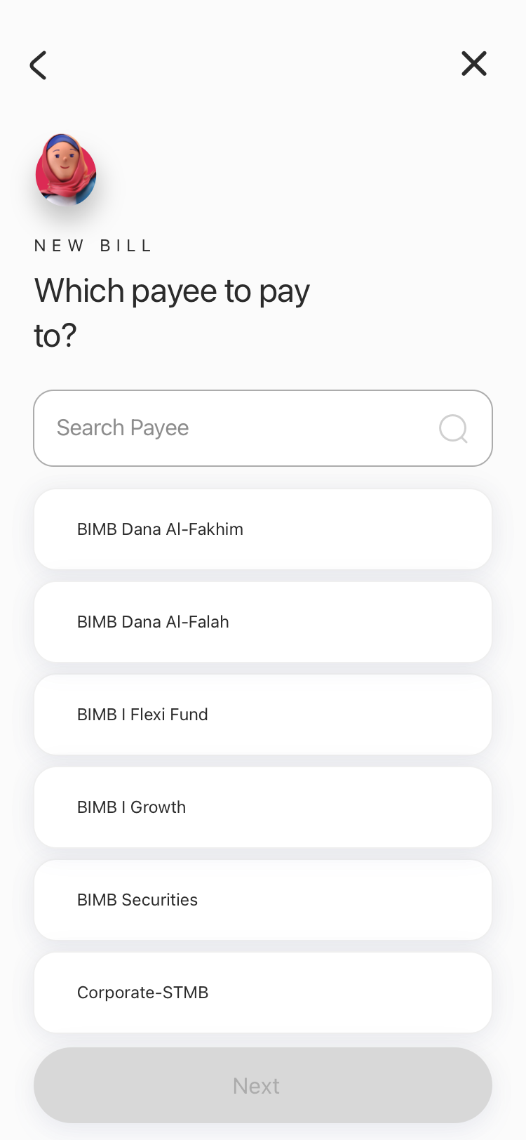
New Bill: search and choose a payee
New bill
JomPAY: biller code and references
JomPAY
Pay Card: card and amount type
Pay card
Pay Financing: financing due this month
Pay financing
05 · Final solution

On desktop

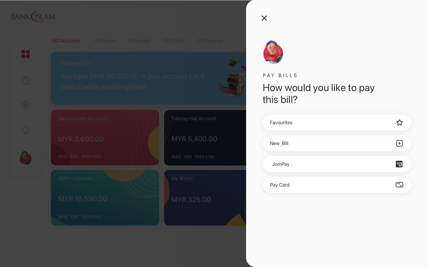
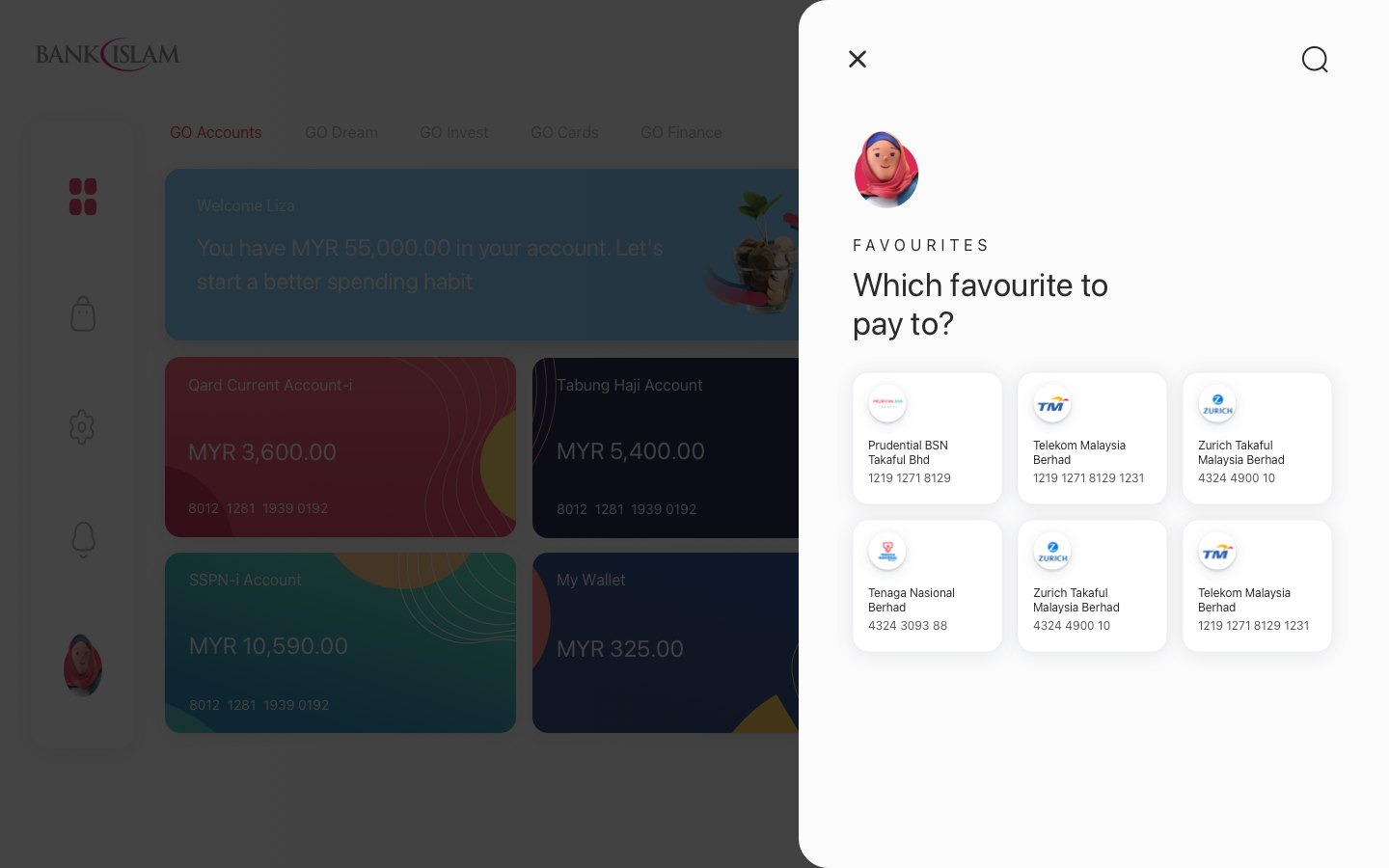
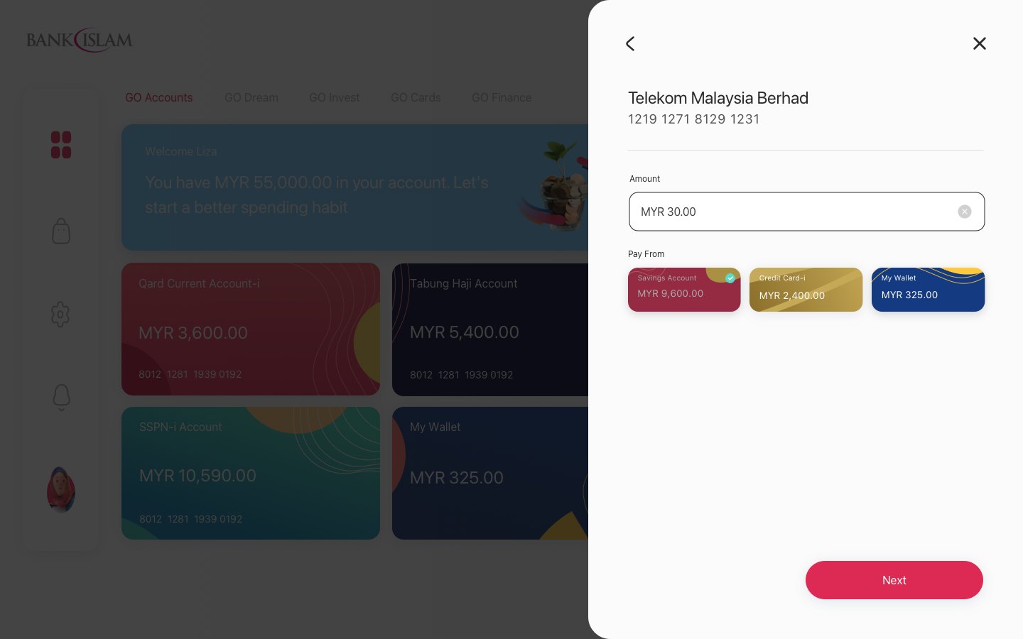
Pay Bills opens as a side panel over the dashboard, so people keep sight of their accounts while they pay. Favourites and New Bill follow the same steps as on mobile.

Desktop: Pay Bills side panel over the dashboard
Desktop: Favourites list in a side panel
Desktop: New Bill amount screen in a side panel
05 · Final solution

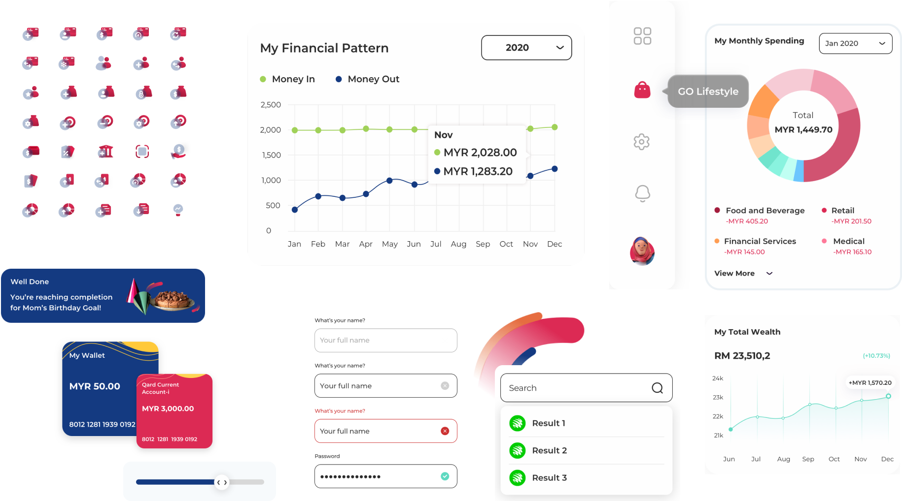
Design system

A shared design system keeps desktop and mobile consistent, covering typography, a component library and an icon set — ensuring the same visual language across desktop and mobile.
Design system
06 · Validation

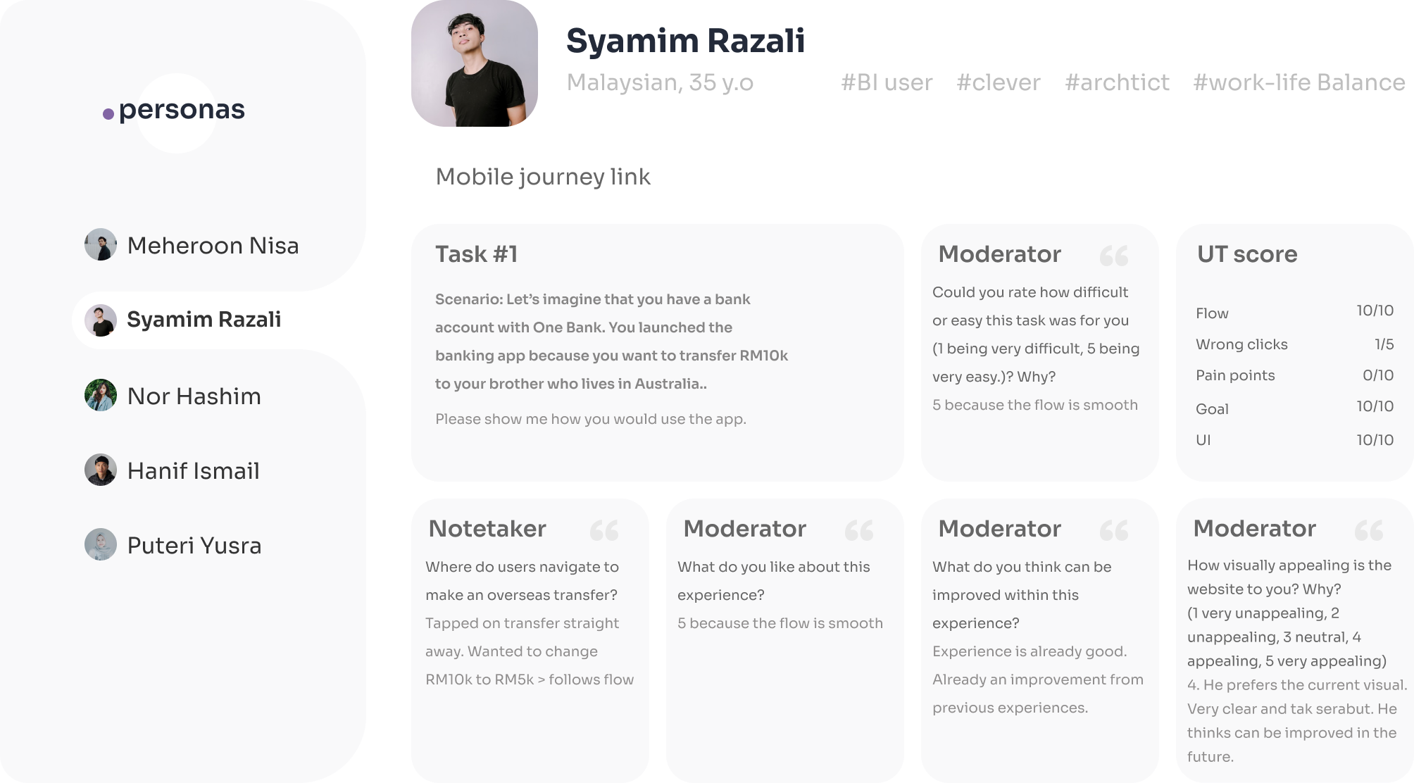
Usability testing

Moderated sessions on high-fidelity prototypes, on mobile and desktop.

Participants

9 people in two groups, students and graduates, aged 17 to 30.

Method

A short interview, then a scenario task. After the task, people rated ease from 1 to 5 and told us what they liked and what to improve.

Task in scope

Sending money to a payee, on the mobile and desktop journeys.

Example questions

  • “How easy or difficult was this task, from 1 to 5? Why?”
  • “What do you like about this experience?”
  • “What do you think can be improved?”
  • “Where would you go to send money?”
Usability testing sessions
06 · Validation

What testing told us

3 of 9

Pay bills regularly

Paying bills, and sometimes financing, is part of their routine.

Our responsePay Bills covers JomPAY, cards and financing.
3 of 9

Raised favourites

They wanted saved payees, grouped by type, and a clearer favourite button.

Our responseA dedicated Favourites list, and an offer to save a biller after paying.
2 of 9

Too many steps or fields

Clicking Next many times felt long. They preferred fewer pages.

Our responseSaved billers arrive filled in, and each flow ends in one review card.
07 · Outcomes

Project delivery

I designed and prototyped Pay Bills across both channels, then handed the designs and recommendations to the client for implementation.

5 routes

Mobile

Favourites, New Bill, JomPAY, Pay Card and Pay Financing.

2 routes

Desktop

Favourites and New Bill, in a side panel.

1 report

Dashboard

A spending summary by category.

Clickable prototypes

One for mobile and one for desktop, in the Final solution section.

Tested before handover

Findings shaped refinements. Post-launch data was out of scope.

Bank Islam

Thank you

Thank you for taking the time to read this case study.